31
Decoding the word Mobile Optimized Website in 2019
Table of Contents
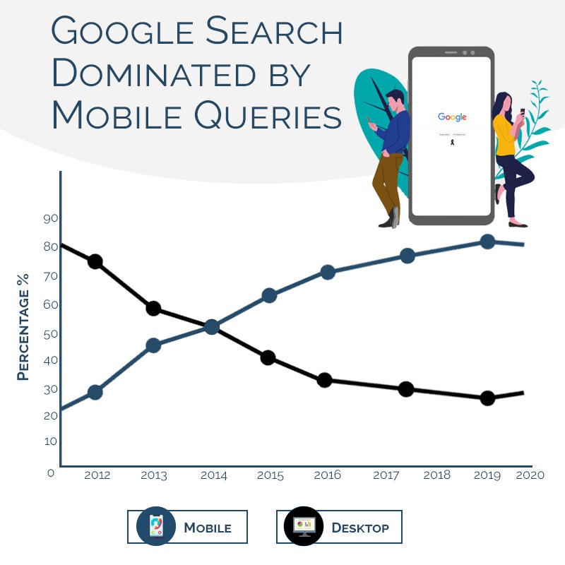
Considering the latest update of Mobile First-Index and due to huge surge of traffic from mobile devices which surpassed the desktop traffic in recent years, the demand for Mobile Optimization has reached a new level.
The below graph illustrates the vast growth of Mobile VS Desktop from 2012-2020:

So the key question that hovers over the mind is “How do we compete and make sure that we are providing the best Mobile User Experience for our visitors?”
The answer is thorough Research and perfect implementation. So let us dig in and evaluate the meaning of these 2 powerful terms.
Research: How to conduct a competitor research for creating an advanced mobile strategy for 2019

One of the most important aspect for any kind of research is to get into the shoes of “What your competitors are doing?”.
Similarly for mobile optimization, the game begins with the study on your competitor abilities to dominate the mobile era.
Important Tip: Study both local as well as global competitors in the same niche to get the best strategy out of your competition.
- Review of Design Implementation – What kind of implementation they are following i.e.
- Progressive Web App Design
- Responsive Design
- Mobile Separate Design
- Dynamic Serving
- Accelerated Mobile Pages
to get a proper overview of “What is working in your niche and what is not?” is a must.
We will be discussing these implementations ahead in full detail in the “Implementation” phase.
2. Review of UX Elements in the buyers journey –

With coming up of AI technologies and day to day advancements, it is very important to study what kind of new UX elements are being offered by the competitors to interact with the targeted audience at each level of buyers journey i.e.
- Global Usage – What kind of navigation they are utilising, font size, content decoration styles and colour combinations.
- Awareness Stage – Checkout the Main Blog and individual blog post representations, what kind of features and how they are represented to interact with users i.e. Social media sharing buttons, subscriber forms, banners and images, offers etc. Checkout how PDF and other type of knowledge based elements are used on the website i.e. example e-books and infographics. Some trending features like approximate time of blog reading, featured post/New Posts or Top posts representation can be reviewed as well.
- Consideration and Decision Stage – E-commerce website have incorporated products, software website may contain demos. Studying their representations allow you to create the best layout for your website for the consideration and decision stages. Some powerful examples may be Reviews layout, Product Features Layout, Comparison Charts Layout, Feedback Form Layout, Customer Service Elements, Clear Product Images and Pricing. Also, very important is to review the check out process and the forms layout. Any leakage in customer flow can be a big loss.
3. Technical Aspects – Study the technical aspects of your competitors i.e. compare page loading speed, light house elements, AMP implementations using tools. Be the best out of the same, improvise where required. The best option is outrank the Top 3 competitors by creating an excel comparison sheet and updating it on regular basis for all the technical elements.
Studying the various implementation options for a mobile optimized website in 2018:
1. Separate Mobile Design
The design that is specifically made for mobile and is hosted on a separate sub-folder and sub-domain is called a mobile dedicated design. Mostly applicable for local businesses that wants to showcase “to the point content” or a website with “vast amount of content” which may be difficult to showcase in a responsive design.

Below are some of the things to remember:
- Have a clearly defined Rel=Alternate Tag on the desktop version and Canonical tag of the desktop version on the mobile sub domain or sub folder to clearly represent the implementation of separate mobile design.
Example of a Rel=Alternate tag –
<link rel=”alternate” href=”http://m.yourdomain.com/example-page” >
For further implementation you can also view the article of Stone Temple here.
- The use of Vary:User-Agent Header – Whenever a visitor visits a webpage, it sends a User Agent of the particular device being used to the web server, a specific code is placed on the website to make sure the most suitable version of your website is detected using the Vary:User-Agent Header script.
The code can be found here with more elaboration on the topic.
- Proper Meta codes to be used on each mobile optimised webpage – As each mobile web page has a different url of the desktop version so it is very important to make sure that all meta codes are present on the mobile urls as well, that are there on the corresponding desktop version of the same webpage.
- Review of Structured Data as compared to Desktop – Another issue mostly found with the separate mobile design is the missing of the structure data. The structured data also has to be same for both the version of pages in order to not miss any SEO opportunities.
- Appropriate use of Href-Lang tags, if you have an international website. Remember for the mobile dedicated structure you need to point the href-lang tags towards the mobile version of the website.
- Proper Pagination as compared to Desktop – Many website auto load the rest of the pages in the mobile version rather than using the pagination rel=prev and rel=next tags. Need to have the same structure as desktop so that all the content is indexed.
- Redirects – Redirect of 404 pages which has to simultaneously work for desktop as well as for mobile website, are often missed, so have to make sure the redirections are properly applied for both the variations.
- Make sure to copy same rules in robots.txt as they are in desktop version i.e. unnecessary folders and pages must remain blocked on both the versions.
- Verify the mobile version in Google Webmaster Tools – Yes, if it is a sub domain then it has to be verified separately in the GWT console, however you don’t need to do in case you are using a sub-folder. Here is a question answered on Google forums for the same query.
- Review of content, headlines as compared to Desktop – After mobile first index, it is very important that you review the content density on your separate mobile website as lack of content means lack of rankings.
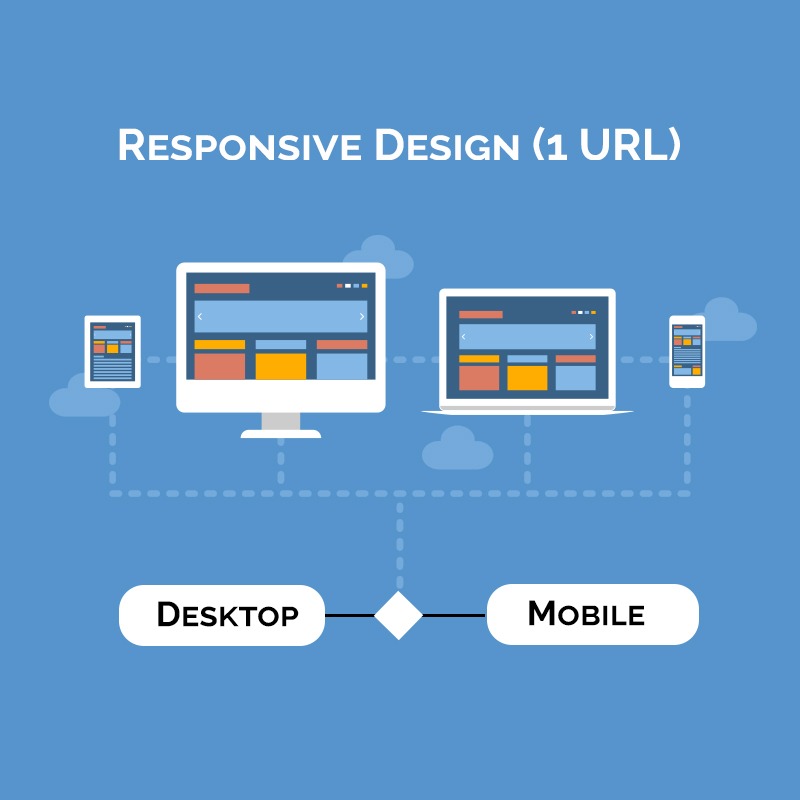
2. Responsive Design –
Most used, Recommended. Google Loves it! Easy to implement, cost effective as well and has been used by majority of the websites. The design that automatically fetches the same code or HTML of desktop and renders itself according to the device being used is called responsive design.
Some of the points to consider:
- It uses a meta viewport tag to detect the resolution (Width and scaling) of the device being used by the user and thus render itself according to the same.
- As stated “Google loves it” as it does not have to crawl another version of the website or duplicate content thus saving its crawler budget i.e. time and effort.
- Page Loading Speed: Main painpoint for responsive website is with the page speed. As they have to load all the elements and content of the desktop version, it becomes a problem to get a good page loading speed. Make sure you check the page loading speed of each page using Google Page Speed Insight tool.
- Google states not to hide your javascript and CSS, while most of the designers and developers does the same in order to achieve the target of a clean website. Has to be avoided at all cost. Make sure to “Fetch as Mobile” in GWT to check if all javascript, CSS and images are being crawled and are not blocked.
- Site Architecture – Most of the top websites like Microsoft, Disney etc which are critically acclaimed as one of the best responsive websites have lot of responsive issues which lead to bad U/X. For an example: the “Games” option on Disney website had huge bugs. Also, comes with this the burden of pixilate images, formatting of charts and graphs and size of CTA’s being used on mobile are smaller as compared to desktop so designer has to optimize for the touch rather than scrolling and then clicking.
Tip: Try to use CTA buttons of 44 X 44 pixels.
- Hiding Content – Another issue is with hidden content, most of the responsive versions in order to showcase the best elements, hide their desktop elements, which leads to lack of content or copied content on the same version. Has to be avoided. Best strategy is of aligning Content i.e Make sure to use the CTA banner on Top mobile fold and long fold content after the same.
3. Dynamic Serving –
In dynamic serving, the URL remains the same but the content & HTML changes for different versions of mobile, tablet and desktop by detecting the user device.

- Again, it uses the Vary:User-Agent Header to detect the user agent being used by the user and then fetches the appropriate version accordingly.
Note: The issue for using Vary:User-Agent Header tag is that it the user agent list has to be constantly maintained in order to give the right UX to bots as well as user, which is a hard job and often leads to redirection issues.
- It is an expensive affair as it requires a lot of effort from design and development team.
- Most of the points, as discussed with the separate mobile website exists with dynamic serving as well regarding to meta codes, structured data and content structuring. Have to make sure that the codes are same for both the versions.
- Caching issue is another problem faced as only version is cached i.e. either mobile or desktop so there are many chances that a mobile visitor may get the cached version of the desktop. However, solution is to properly use the cache plugins to use only the desktop cache.
4. Progressive Web Apps –
A mobile website that behaves like a web app and can be used offline is called PWA. Aliexpress and Filpkart elite are an examples of PWA. Both the websites multiplied their sales and user interaction using PWA.
Video: Get Example from an andriod phone.
More information – Download Ali Express Case Study
- Uses service workers (A connection between your browser and device) to store, update data and send push notifications.
- PWA stores data and cache once a visitor visits the websites and prompts visitor to add a PWA icon to the home screen, once done the service workers then help to send push notifications.
- Requires lot of expertise for implementation and is recommended only if you need an APP like experience.
- The downward side is that some of the browsers still does not support PWA so may result in a broken link.
- From SEO prospective, make sure you have SEO-friendly URLs and not the ones with a # as Google will neglect everything after #.
- Make sure to use a proper sitemap for indexing of PWA urls.
- Check the “Fetch and Render” option for the PWA pages to make sure they are being indexed properly.
- Make sure to copy all content, Structured Data and Meta data from the desktop version.
- Make sure to use the canonical version of desktop pages on the PWA pages where there is copied content.
- Use the Vary User Agent header to indicate the user agent and make sure the redirections are proper.
- Website has to be secure in order to make a PWA.
- Use light house to make sure the PWA has all the important elements incorporated.
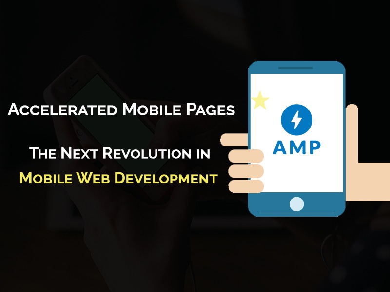
5. Accelerated Mobile Pages –
Next in the league, come the introduction of Accelerated Mobile pages. The pages that are built by stripping of some desktop elements and javascript and uses AMP HTML, AMP JS which is stored in AMP Cache to give a top notch page loading speed i.e. 4X more than a regular responsive webpage
- Tedious implementation – In wordpress, simple plugins and rework of htaccess file helps in the implementation, whereas in other platforms, developer has to download the code for AMP Project website. You need a developer for the implementation.
- Canonical Tags – Canonical tags needs to be implemented on the AMP versions for desktop urls to showcase proper implementation and rel=”amphtml” tag has to be placed on the corresponding desktop webpage.
- Mostly applicable for major content publishing sections such as Blog, News etc may not considered for product or service pages.
- AMP Articles are favoured by Google as well. One can see AMP tag on the Google search engine which also is listed in the top carousel on the search.
- Difficult for advertisers, as only one advertisement tag can be used on one page, which is also very difficult to implement.
- Great UX – Studies have shown increased interaction, reduced bounce rate and even rise in conversions for websites that have switched to AMP.
- AMP AD Landing Pages – Can help you create fast and attractive landing pages for your Google Ads. AMP Analytic can further combine with the same to run conversion tracking codes and re-marketing codes.Some common AMP Tags that can be used with-in landing page:
- amp-bind: Add custom stateful interactivity based on JavaScript-like events.
- amp-form: Create landing pages that require input from the user.
- amp-carousel: Create an image carousel with standard controls for scrolling an image gallery.
- amp-lightbox: Display a full-screen view of a component like an image when it’s interacted with.
- amp-live-list: Render a live stream of content into the landing page.
- amp-call-tracking Dynamically replaces a phone number in a hyperlink to enable call tracking.
More information can be found here:
- AMP Analytics and GWT – AMP is supported by Google analytic, AMP Analytic provides you a desired script that can be used on AMP pages for tracking, as well you can review the results in the GWT for the same.
- Domain Authority – All the urls resides on Google, so getting a link back for AMP towards your websites is not possible which results in loss of backlinks thus DA. However, by late 2018, Google plans to roll out publisher URL in search for AMP websites.
- Design Issues – As major chunk of javascript etc is removed from the AMP version so the design is not lucrative as that of a desktop version. Main focus of AMP is fast loading and readability. Therefore, majority of the websites using AMP are content publishing websites.
- Google Validation – Google Validation plays a major role in showcasing AMP pages on the search result i.e. until and unless Google is sure that there are no errors in implementation, it will not showcase AMP pages in the search result.
- Continuous improvement – Still not being adapted by majority users, the AMP project still requires a major growth in prospect of design. However, as link-e-din, twitter and other major guns supporting the initiative it is bound to receive a major boost in coming years.
The question at the end of the day, comes with which mobile implementation is best for your business in 2019?
The answer is: It depends upon the nature of your business. As mentioned, content publishing websites may opt for AMP, e-commerce websites or website that loves APP may switch to PWA, while responsive may be loved by majority of the owners due to less cost, less SEO work as well as the reason Google favours the same.
However, i do believe, studying your audience plays a major role in the creation and optimization of mobile website. For example, Combination of PWA + AMP can do wonders if implemented correctly and can be considered as one of the powerful combination for coming year. Similarly, AMP + Responsive can also be combined together.
Some of additional checkpoints that you can consider while reviewing are:
- Study Analytics – Best way to build a strategy is to study the analytical behaviour of the mobile visitor and improvise step by step i.e. mobile devices being used, avg time of site, bounce rate, conversion and traffic ratio etc. May be trying out A/B testing can really help as well.
- HSTS – Though new, HSTS can be a replacement for faster loading speed for HTTP. It adds an extra security layer as well. And Google loves secure websites.
- Monitor Rankings – Desktop and Mobile rankings are different. Keep a regular check on the same by using tools like SEM Rush.
- If you are using QR codes, make sure they are not on the desktop version as they are meant to be for a mobile device.
- A check on video is must, most of the websites still load videos with technical glitches which results in bad U/X. Make sure each video is working and easy to navigate.
- Pop-up, Ad banners – Major source of high bounce rate are pop-ups and ad-banners that take important space of your powerful content and may frustrate user in their desired path of conversion. Avoid until it is necessary.
- Maps – For local business or brands in which store finders are essential needs Maps to showcase proper address. Make sure they are not over pixelated.